Two dashboards, three websites, five different directions
Published
Five new HTML, CSS and JavaScript demos: operations, scenario planning, courses, wellness memberships and studio bookings.
Interactive frontend demos
Two dashboards, a course website, a wellness membership and a studio website. Explore five distinct designs with working interactions, built with HTML, custom CSS and vanilla JavaScript.
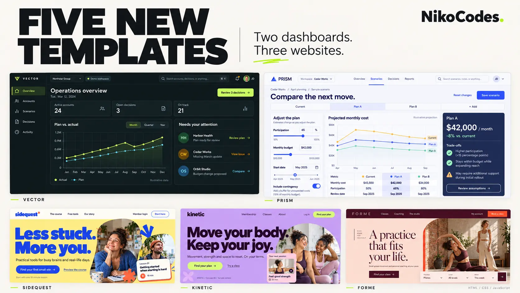
Five different starting points for websites and web applications: an operations dashboard, a planning workspace, a course website, a wellness membership and a studio website.
I wanted each to have its own character. Vector is dark and compact. Prism gives the controls and comparisons more breathing room. Sidequest goes loud with blue and yellow. Kinetic pairs oversized type with purple, pink and lime. Forme takes a warmer direction with burgundy, peach and large serif headings.
All five are built with HTML, custom CSS and vanilla JavaScript, with responsive layouts and interactions you can try in the browser.
Vector — accounts, decisions and the next action
An operations dashboard for reviewing accounts and keeping track of work that needs attention. Search and filter the account list, change a status, or open a decision and approve or defer it. The account records and activity history update as you work.
Dark surfaces and lime accents give the interface a clear hierarchy, with separate views for accounts, scenarios, decisions, activity and settings.
Prism — compare the next move
A planning workspace that puts assumptions beside their results. Adjust participation, budget, timing and contingency, then compare how the sample projections change.
You can keep several scenarios, add a decision note and revisit a saved snapshot. The light palette and indigo controls keep a fairly detailed screen easy to scan.
Sidequest — make the first step approachable
A course and community website with bold blue type, yellow backgrounds and a playful collage layout. It gives visitors a clear introduction to the course, practical resources and a way to try a lesson.
Open the six written sample lessons, work through their checklists and mark them complete. Your progress appears in the sample member area.
Kinetic — a membership with some energy
A wellness membership website built around expressive photography, oversized headings and a purple, pink and lime palette.
Browse classes by category, read a sample session and save favourites. Switch between monthly and yearly pricing, choose a sample plan and revisit your selections in the member preview.
Forme — find a class that fits
A studio and coaching website with warm colours, generous photography and an editorial feel. The class finder sits close to the introduction, giving visitors a practical next step.
Filter by practice, level and week, switch between studio and online sessions, and try making or cancelling a sample reservation.
About the previews
These are interactive frontend demos using fictional brands, sample content and generated imagery. Saved demo progress and selections stay in your browser. Accounts, payments, email delivery and live booking services are not connected; dashboard projections use illustrative data.
If one of these feels close to something you need, get in touch about adapting the design and connecting it to your own content and services.
Published
Five new HTML, CSS and JavaScript demos: operations, scenario planning, courses, wellness memberships and studio bookings.
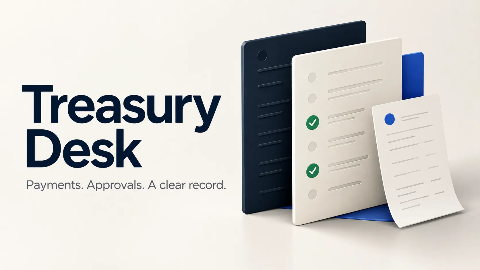
A browser-local crypto treasury demo with payment proposals, two-of-three approvals, revision history, simulated execution and a ledger that records the result.

A browser-local video review demo with timestamped feedback, visual annotations, version comparison and approval tied to a specific cut.
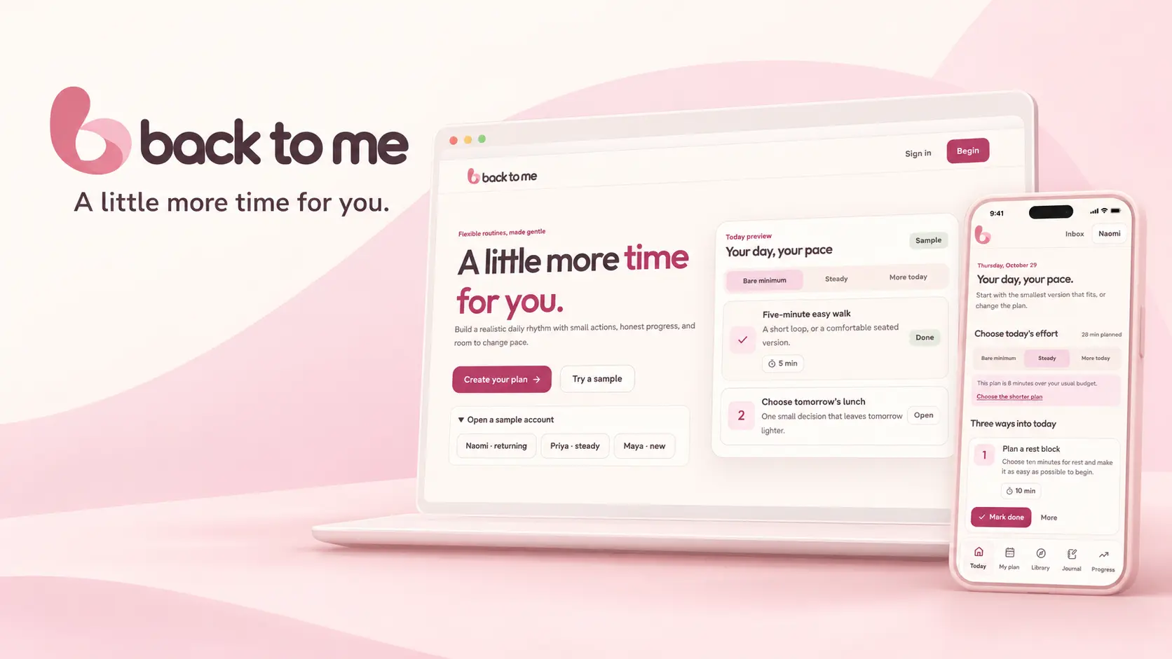
Interactive web application concept
A women’s wellness app concept with flexible daily plans, guided programmes, habits, meal planning and journaling.
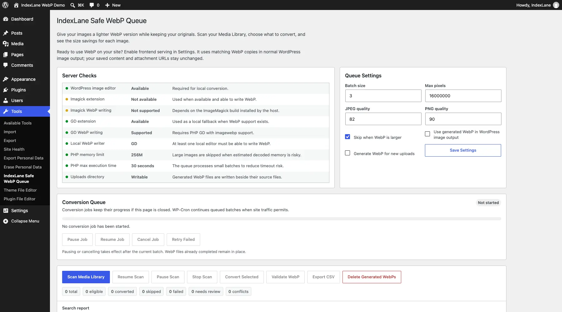
A WordPress plugin that creates WebP and AVIF copies while keeping your original images. Convert in your browser or run background WebP jobs on your hosting, review the savings, and choose when visitors receive the converted images.
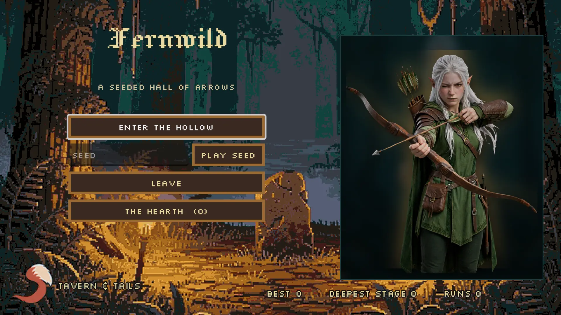
Browser game
A free browser arena shooter starring Fern, an elf with a bow and a limited quiver. Clear four stages, buy upgrades between bosses, and spend earned embers at the Hearth to give the next run a better start.
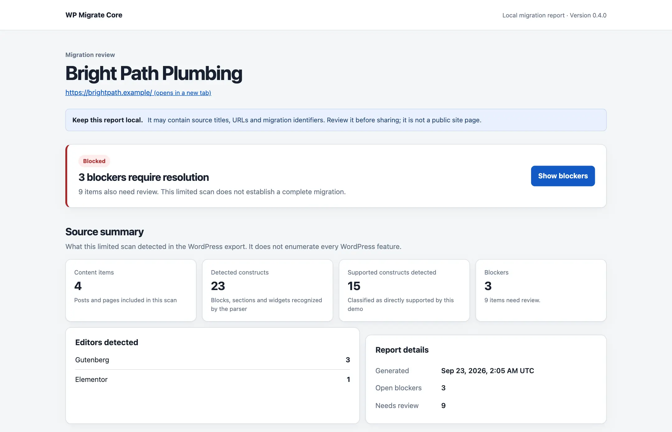
AI-assisted WordPress migration to Astro, Next.js, Payload and Pruvious. Inspect your export, automate repair triage, review suggestions for alt text, shortcodes and URLs, and carry accepted decisions into a repeatable migration.
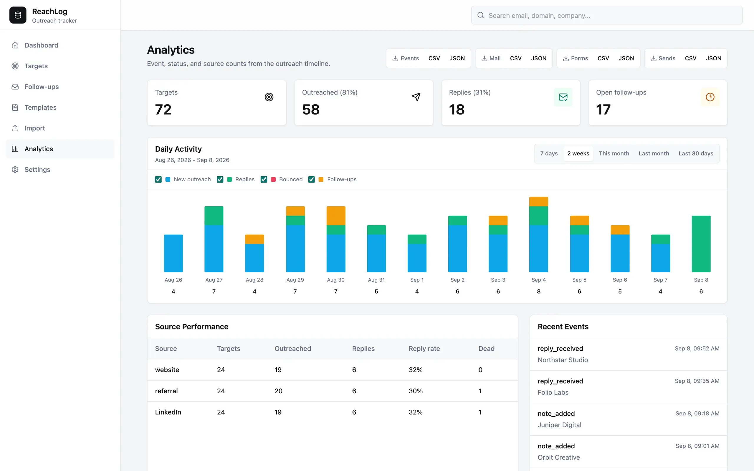
Keep business conversations moving with contacts, email history and a pipeline in one self-hosted app. ReachLog can triage replies, draft follow-ups and capture inbound leads using your chosen AI provider.

A Russian learning game I built for my girlfriend in one day, with phone audio, offline lessons, saved progress, and a room to decorate.
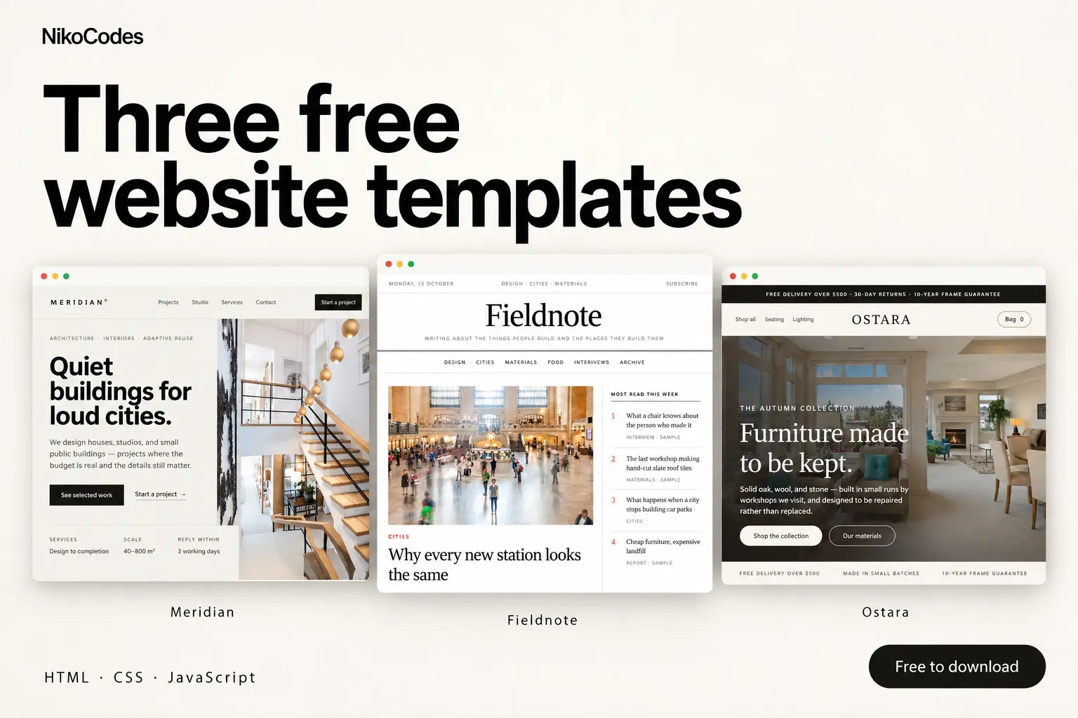
A studio portfolio, an editorial publication and a furniture storefront. Preview Meridian, Fieldnote and Ostara, then download the free HTML, CSS and JavaScript source on Contra.
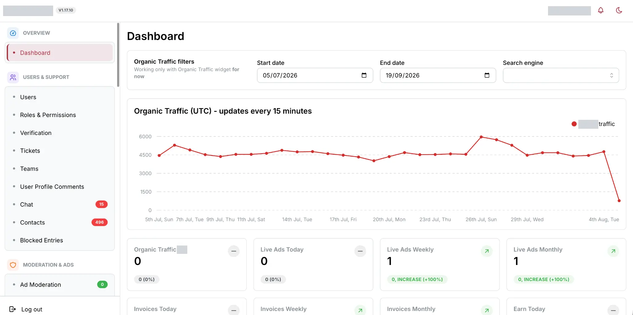
A live platform with 175k+ ads, rebuilt and expanded over three-plus months with Go-rendered public pages and three React dashboards. The work spans prepared listing data, warmup, payments, search, realtime updates, operations and production migration.
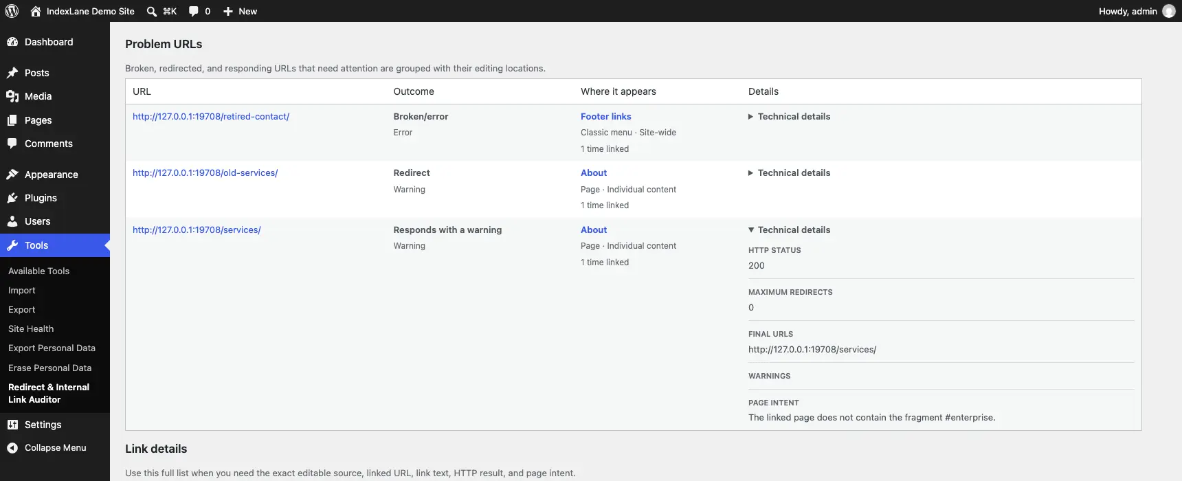
A WordPress plugin for finding broken internal links, redirects and old URLs left behind after a migration. It shows you where those links are used and takes you to the place where you can edit them.
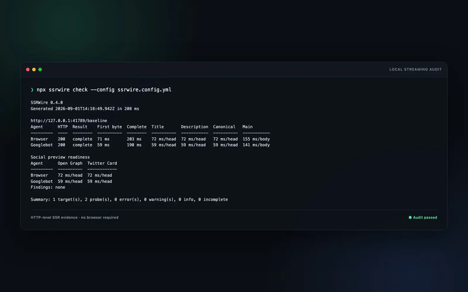
A command-line tool for inspecting the HTML your server sends, including content and metadata that arrive in a stream. It records when important elements appear and compares responses for different browser, search-crawler and social-preview user agents.
A command-line tool for checking that a page delivers the right content and metadata however you reach it. It compares the HTML your server sends, a fresh browser load and the result of clicking through from another page.
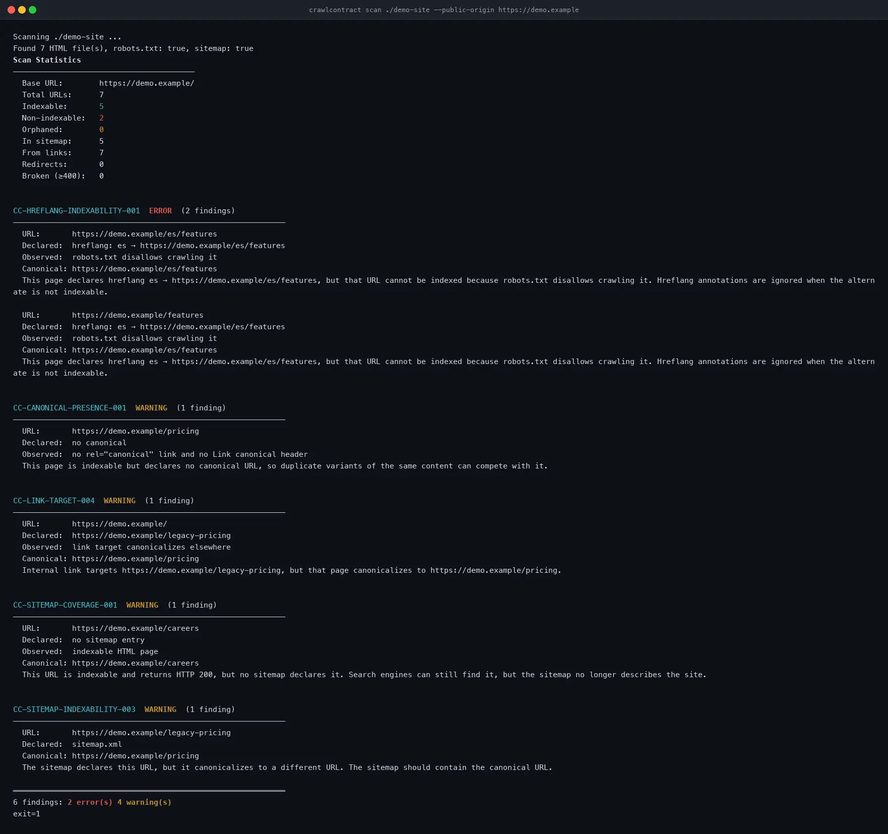
A command-line tool for catching crawl and indexing problems when a website changes. It checks built files or pages fetched from a live or preview site, and compares scans so you can spot problems before a release.

Runnable in Expo Go on iOS and Android
An offline iOS and Android app for recording property issues with photos and notes, then sharing a finished inspection report as a PDF.
A command-line tool for keeping your pgvector indexes in line with a configuration you control. It checks what exists, shows you what needs changing, and can build and replace HNSW indexes when you apply those changes.
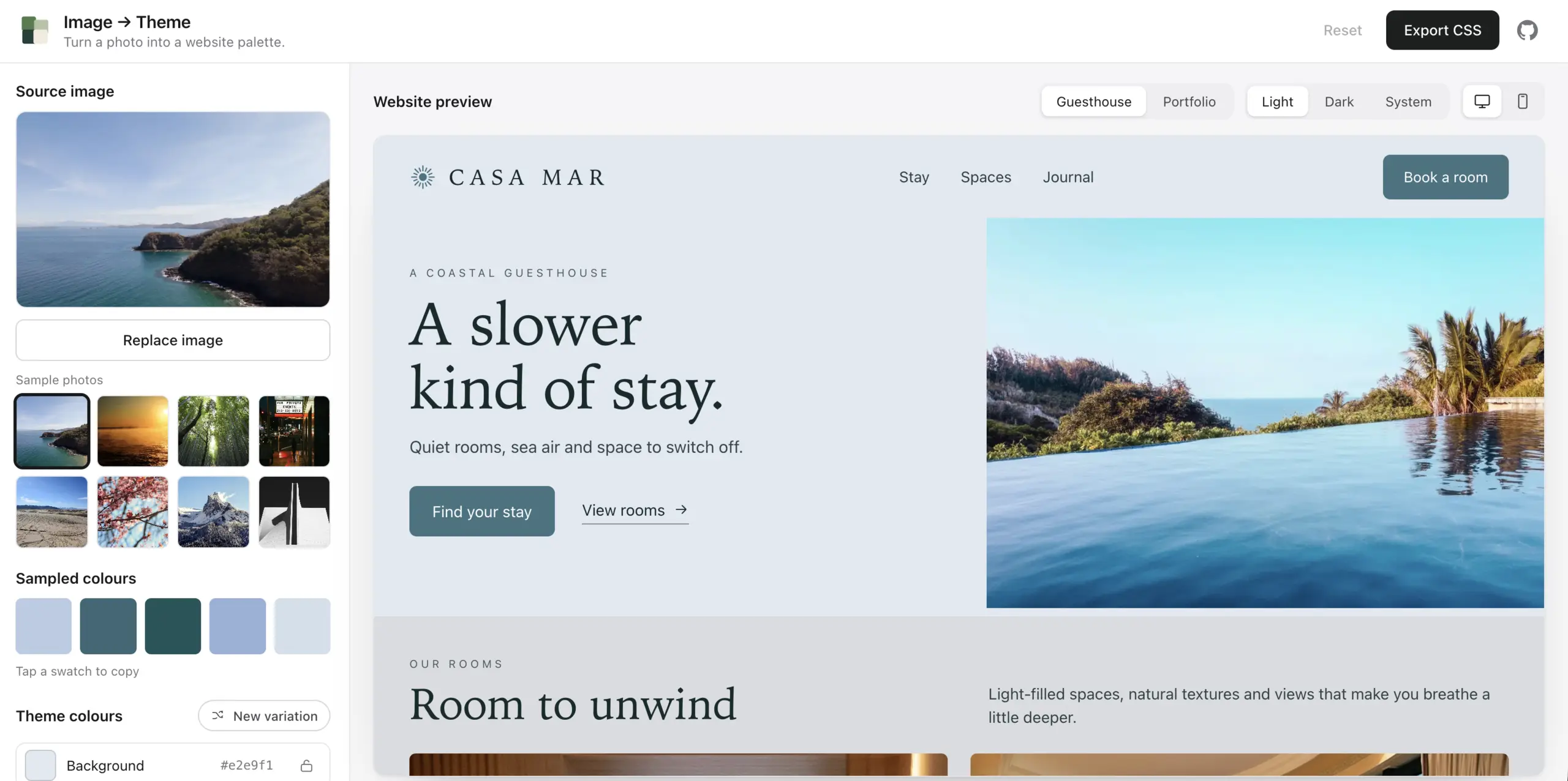
A tool for turning a photo into a website color theme. Drop in an image, see its colors applied to a page, adjust the result and export it as CSS variables or JSON design tokens.

Review and approve WordPress changes through RailCall, then publish or schedule them with an activity log and public-page checks.
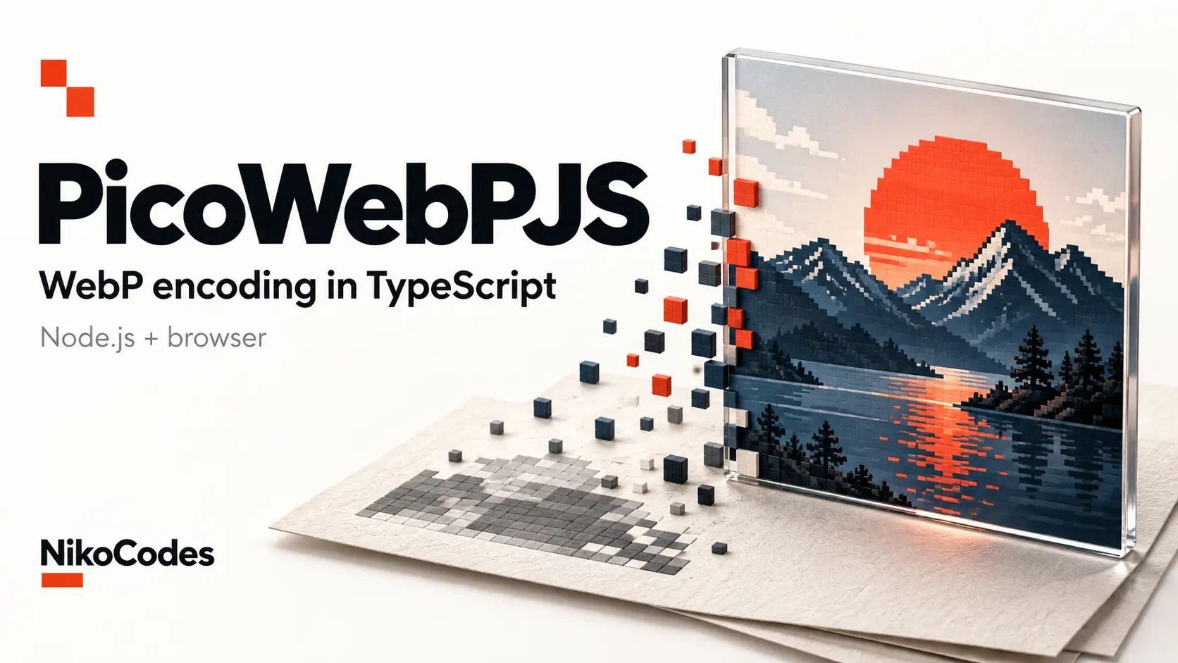
TypeScript library / CLI
Convert images to WebP in Node.js or the browser without native bindings or WebAssembly. A TypeScript encoder with zero runtime dependencies.

A playful character chat with authored replies, session memory and an optional peek at the rules behind the conversation. Built with Next.js, React and JavaScript.
A command-line tool for finding broken links, incorrect redirects and indexing conflicts on a live or preview website. It discovers URLs, checks what your server returns and gives you findings tied to specific pages, with the evidence behind them.
A command-line tool for checking how pgvector search behaves once you add filters. It measures speed, compares approximate results with exact search, and checks query plans to see whether PostgreSQL is using your HNSW index.
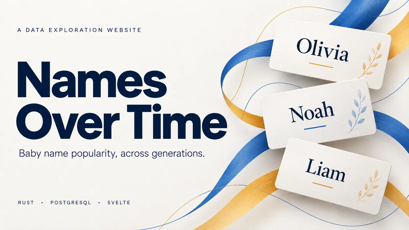
A searchable history of baby names in the US and England & Wales, with popularity charts, yearly rankings and official source data.
A publishing platform for running several websites from structured source data. It handles imports, page generation, scheduled updates and search monitoring through one administration panel. Four domains are live; getting traffic to them remains the unfinished part.
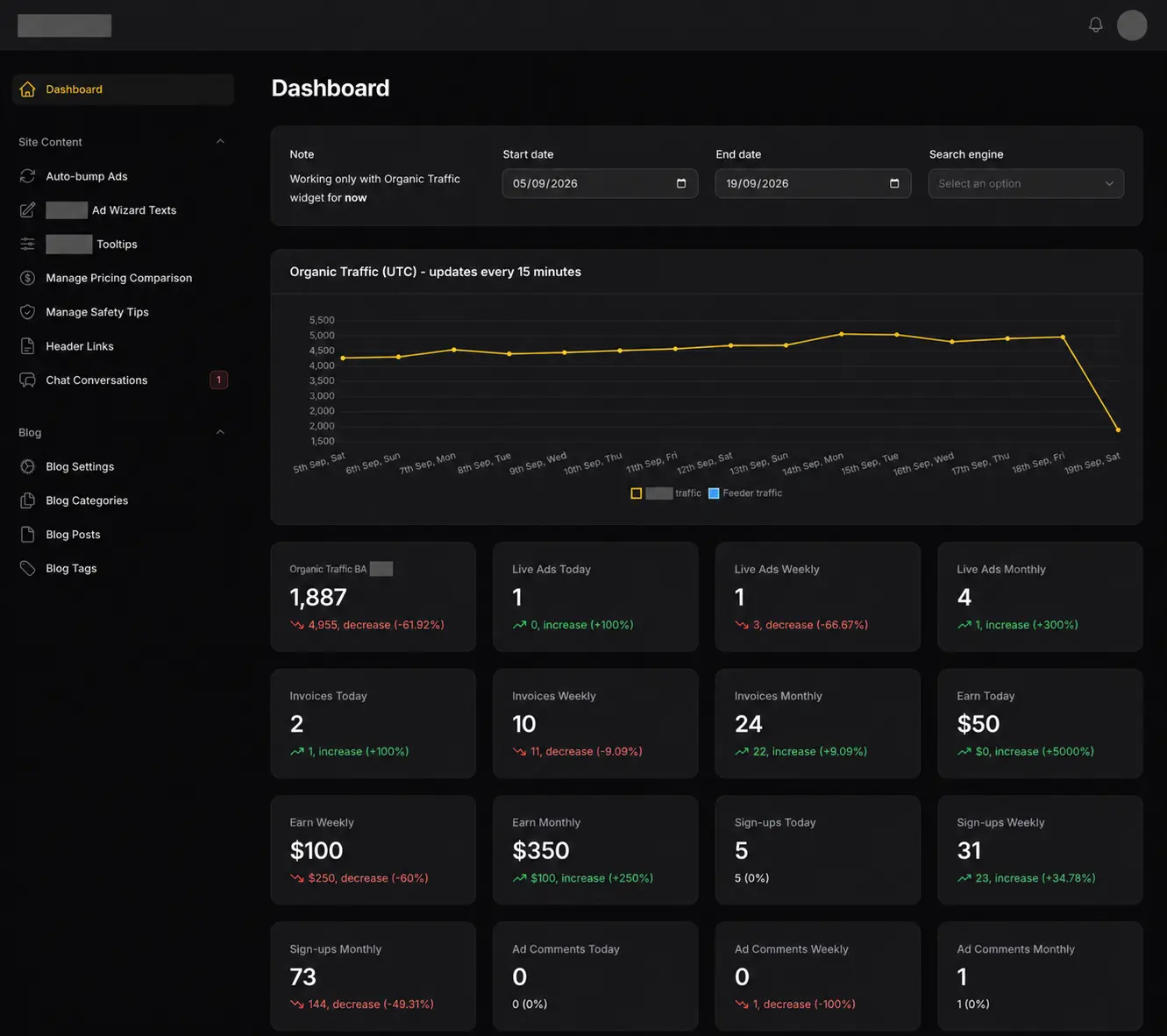
The original Laravel classifieds and advertising platform I built and maintained for roughly two years. It handled listings, payments, live chat and administration before the Go and React rebuild replaced it in production.
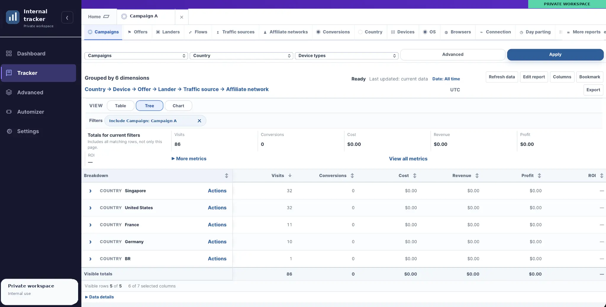
A private platform for routing campaign traffic, tracking clicks and conversions, and comparing performance across sources, offers, and devices.

A private daily planner with a ranked task queue, rollover for movable tasks and a separate activity log. Built for my phone as a PWA.
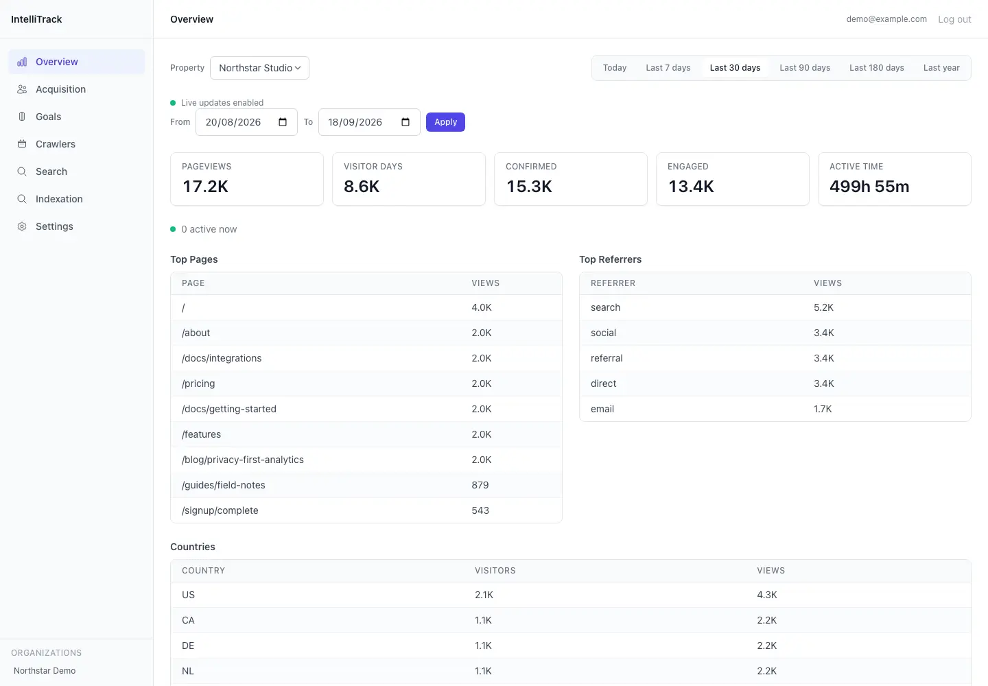
A private analytics tool for tracking website traffic, organic search performance, and activity from search engines and LLM crawlers. It brings ordinary visitor statistics, crawler requests, Google Search Console and Bing Webmaster Tools into one dashboard.
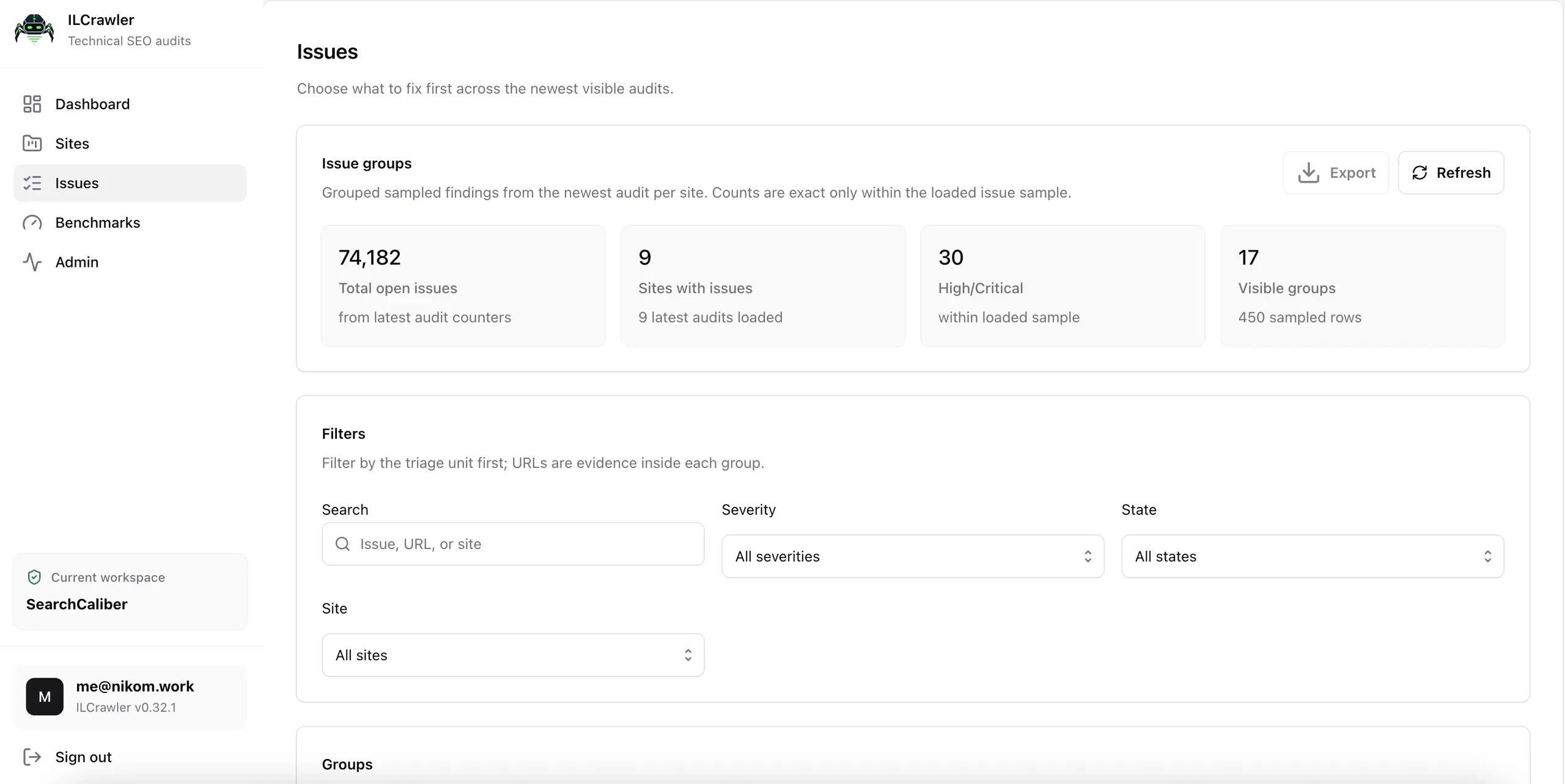
ILCrawler is the technical SEO crawler I use for my own websites and client audits. It brings page checks, links, screenshots, performance samples and reporting into one place. It’s also the project that repeatedly convinced me I was only one rewrite away from being happy with it.
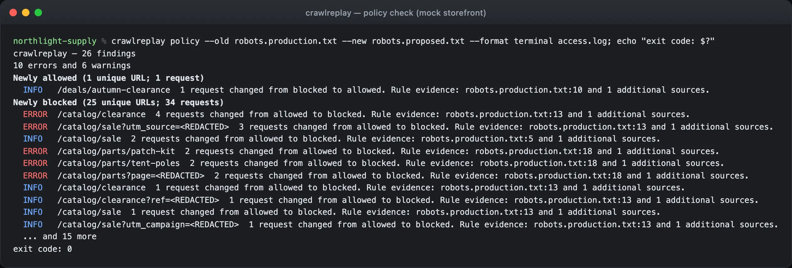
A command-line tool for testing robots.txt changes and new deployments against URLs found in your server logs. It helps you catch newly blocked pages, broken responses and unexpected indexing changes before putting those changes live.
An unlaunched Go rebuild of my publishing platform, using PostgreSQL for application data and background jobs, React for administration and Astro for public websites. It includes source processing, publishing checks and migration tools for the existing sites.
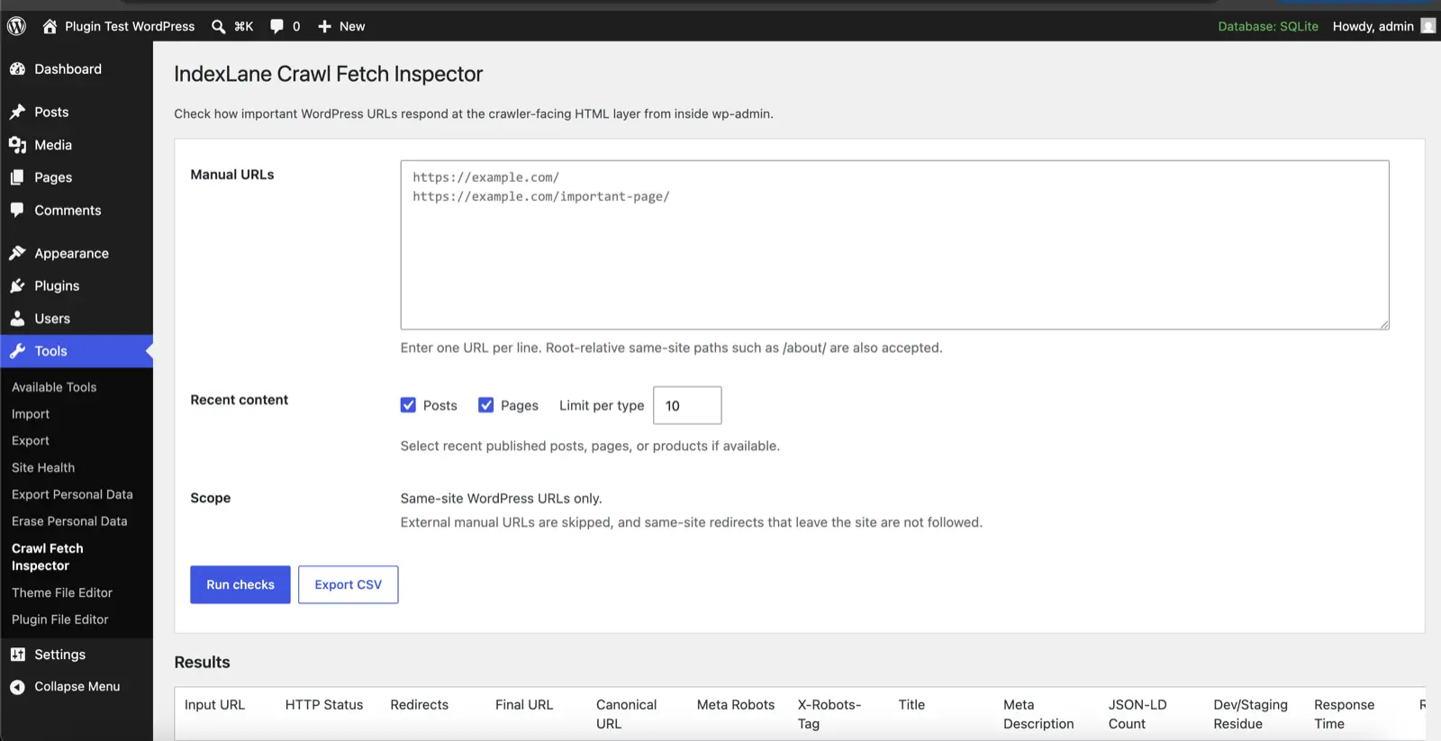
A WordPress plugin for checking redirects, indexing rules, sitemaps and structured data from your dashboard. Particularly handy when you’re launching a site or moving one.
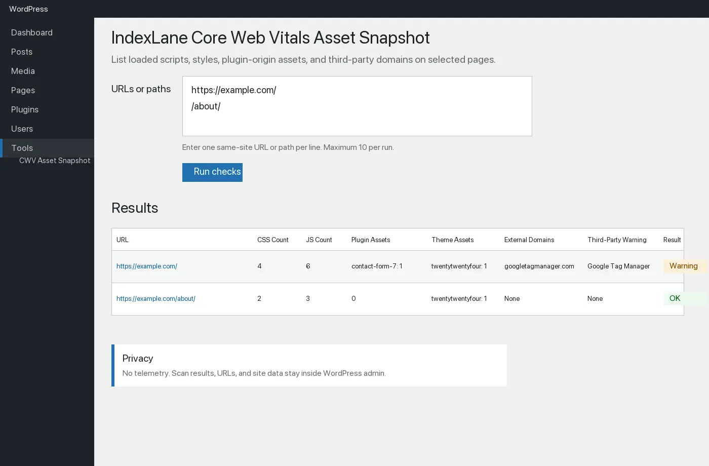
A WordPress plugin for checking the CSS and JavaScript your pages reference, measuring the files it can fetch, and comparing the results over time. Useful when you want to see what a plugin update or site change has added.
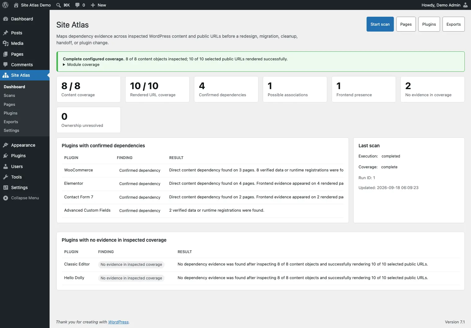
A WordPress plugin for figuring out how a site fits together before you start changing things. It looks at the connections between plugins, content and stored data, which is useful when you’re planning a cleanup, rebuild or handover.
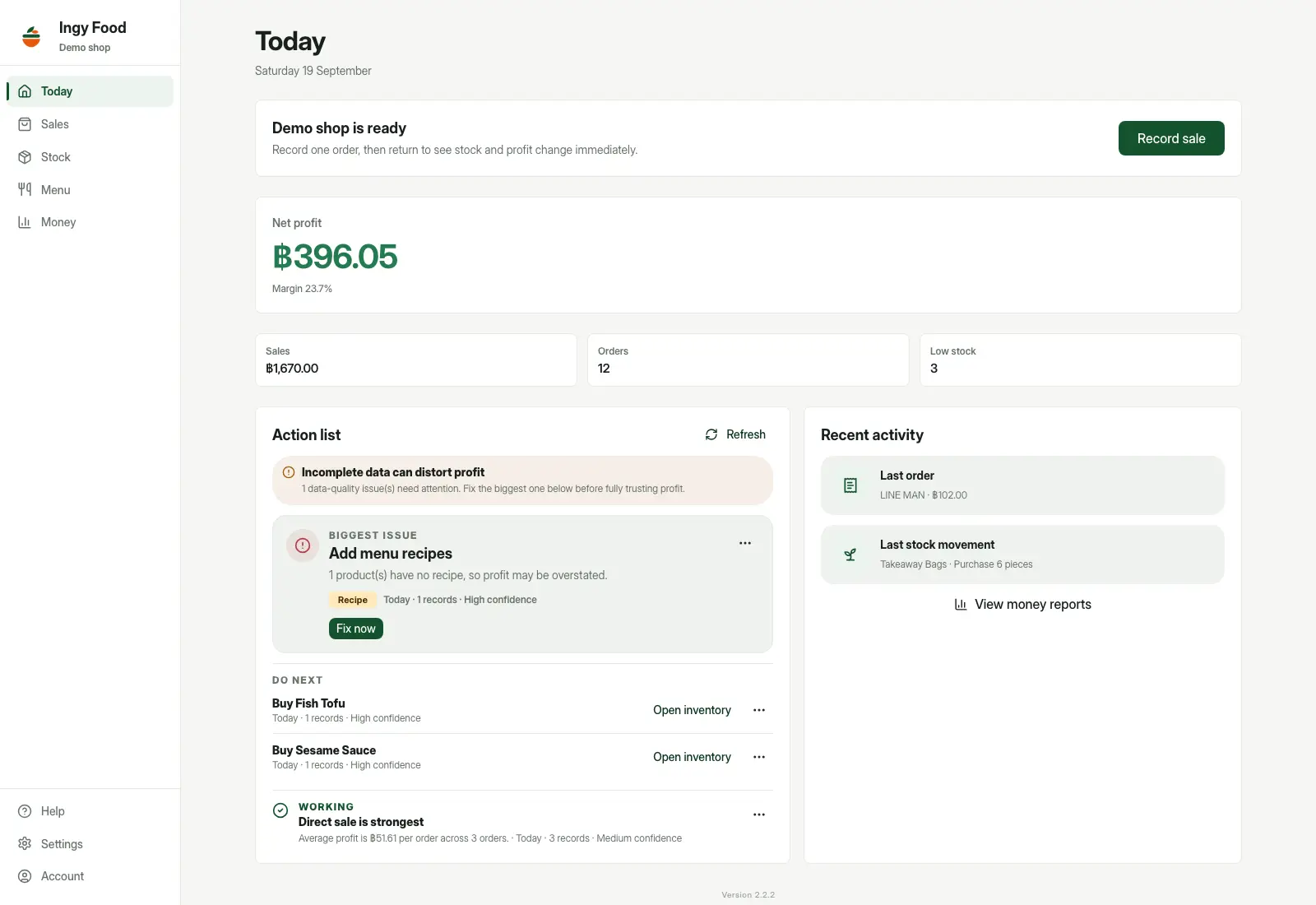
A private app for tracking food costs, stock and estimated profit across direct sales and food delivery. It connects ingredient purchases, recipes, orders and platform fees, helping a seller understand what each dish costs and how much money is actually left.

Personal project · Private prototype · Private source
A Rust infrastructure prototype for monitoring servers, inspecting container applications, and tracking deployment progress in one dashboard.
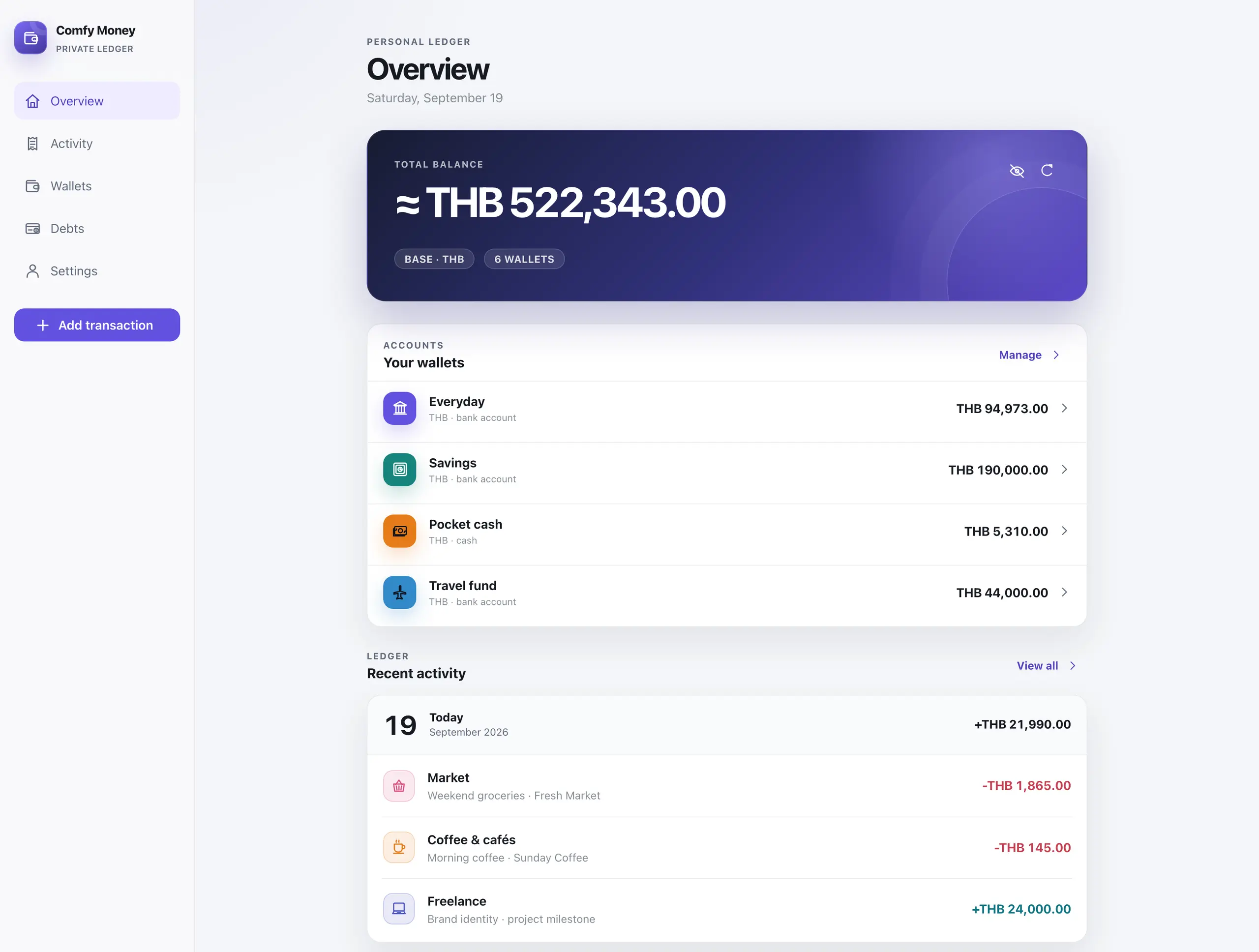
Comfy Money is a private money tracker I built for myself and my family. It handles wallets in different currencies, income, expenses, transfers, budgets and debts, with automatically updated exchange rates and a mobile interface that installs as a PWA.
Personal project · In private use · Private source
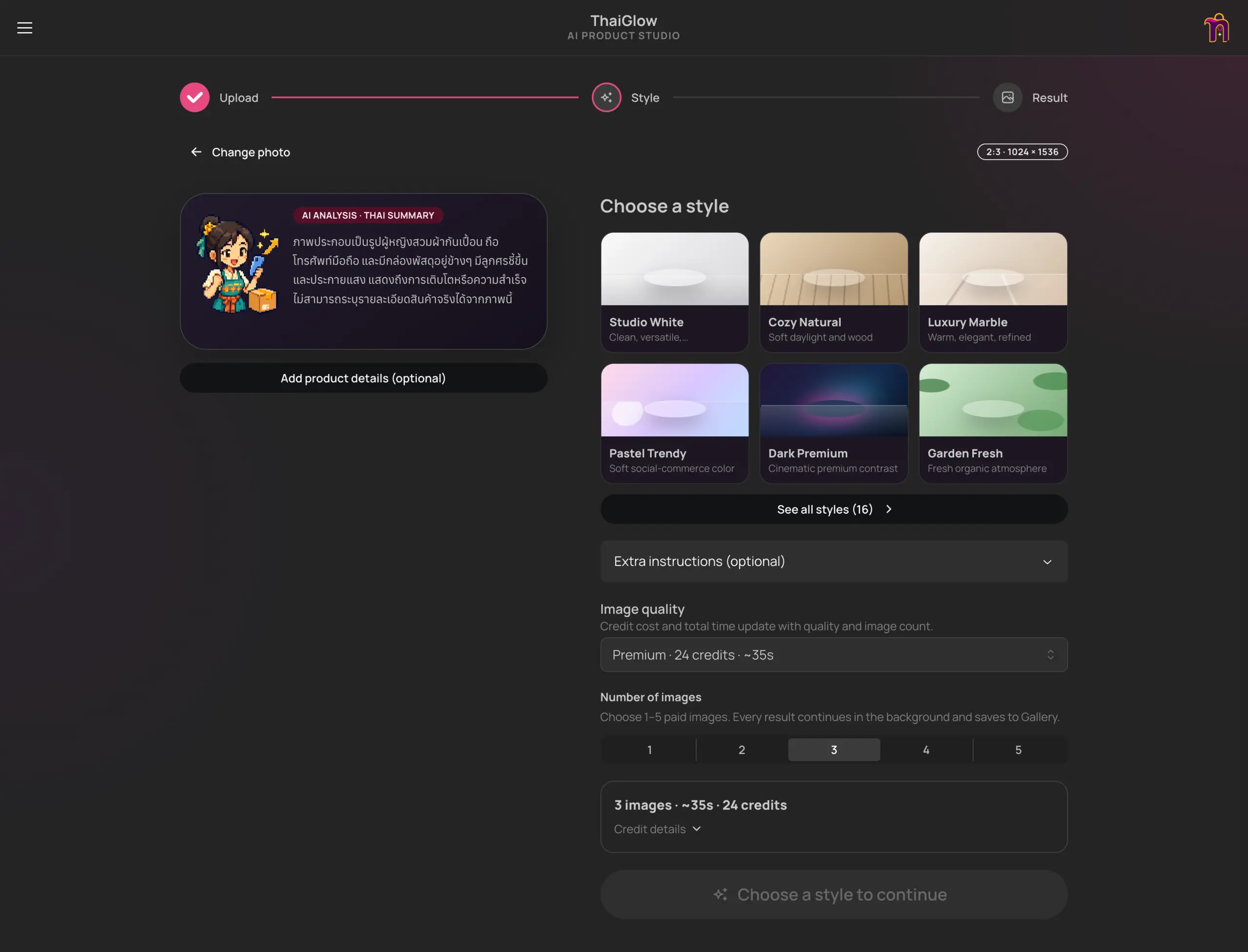
A private AI studio that turns product photos into styled images, short videos, and Thai selling copy, with a simple credit budget.

A playful selling RPG where you attract buyers, pack orders, recruit helpers, and battle the monsters of online shopping — including Refundzilla.

Playable game in development
A playable Godot adventure starring Dexter and Mars. Switch dogs, solve house-and-garden puzzles and keep their mischief under control across two episodes.
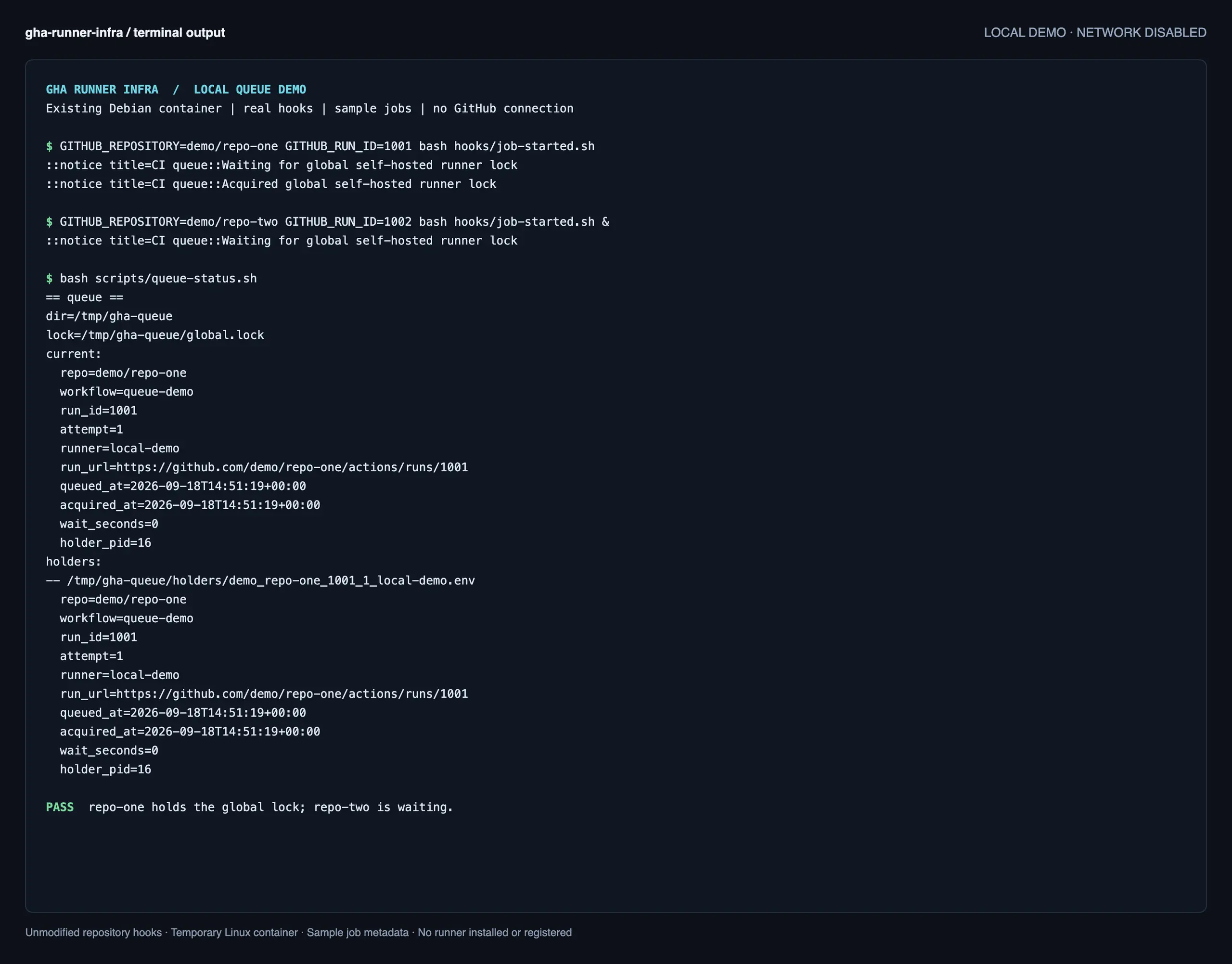
GHA is my private setup for running GitHub Actions runners for multiple repositories on one VDS. It handles runner registration, a shared job queue and resource limits, letting me run CI jobs on my own server while keeping the workflows in GitHub.
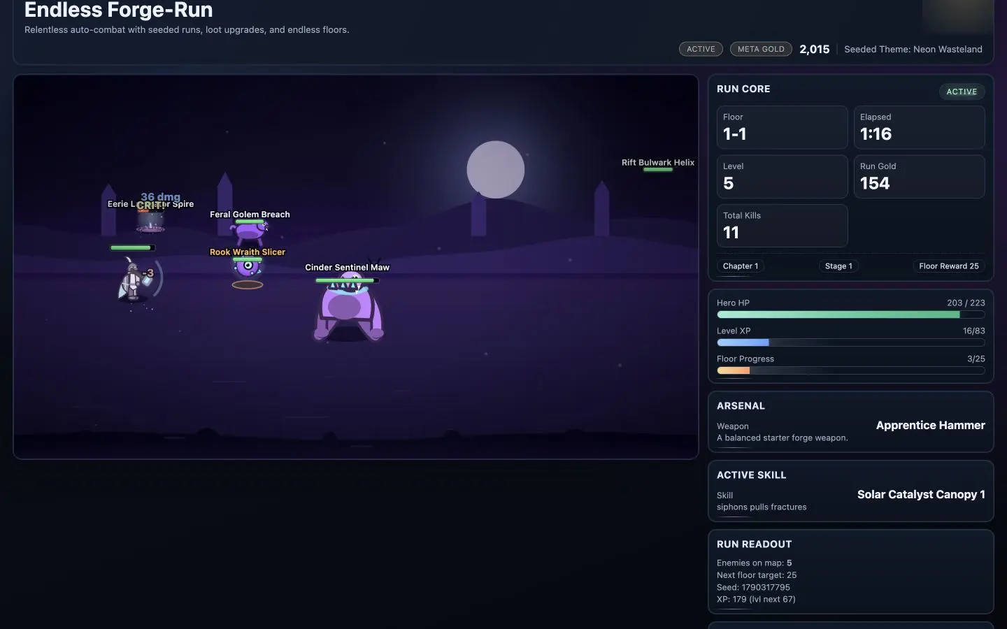
A browser game where your hero fights automatically while you choose weapons and skills, climb tougher floors, and unlock equipment for future runs.
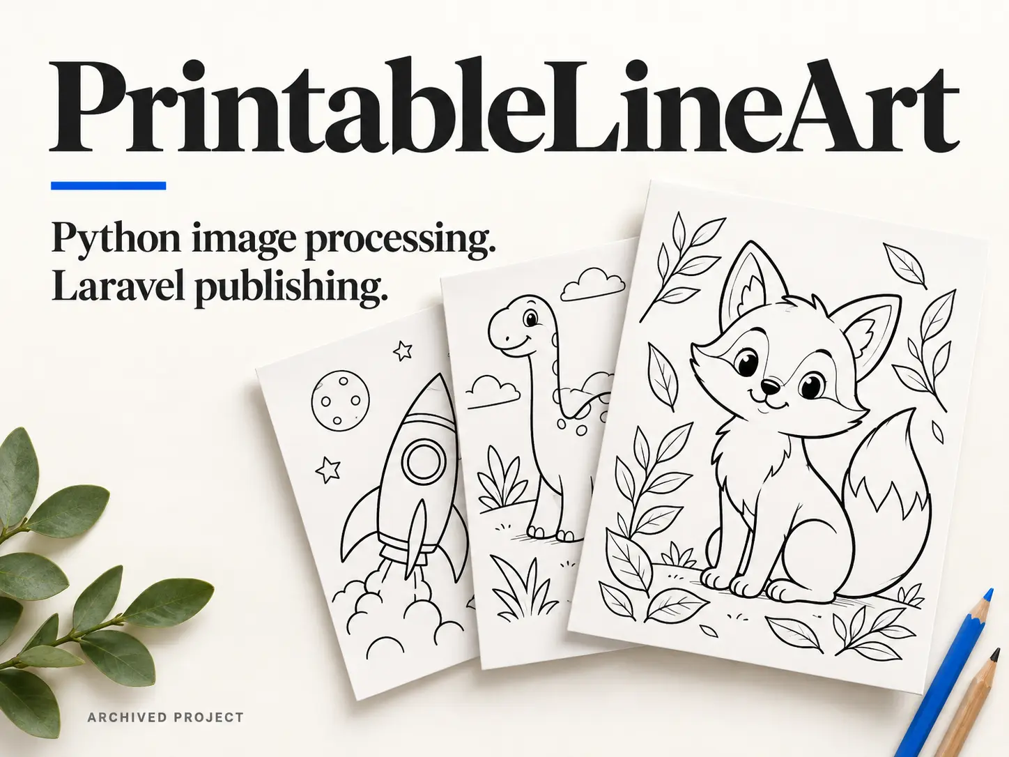
Website / image-processing workflow
An archived colouring-page website with a Python workflow for generating printable PNGs and PDFs, and a Laravel application for importing, organising and publishing them.
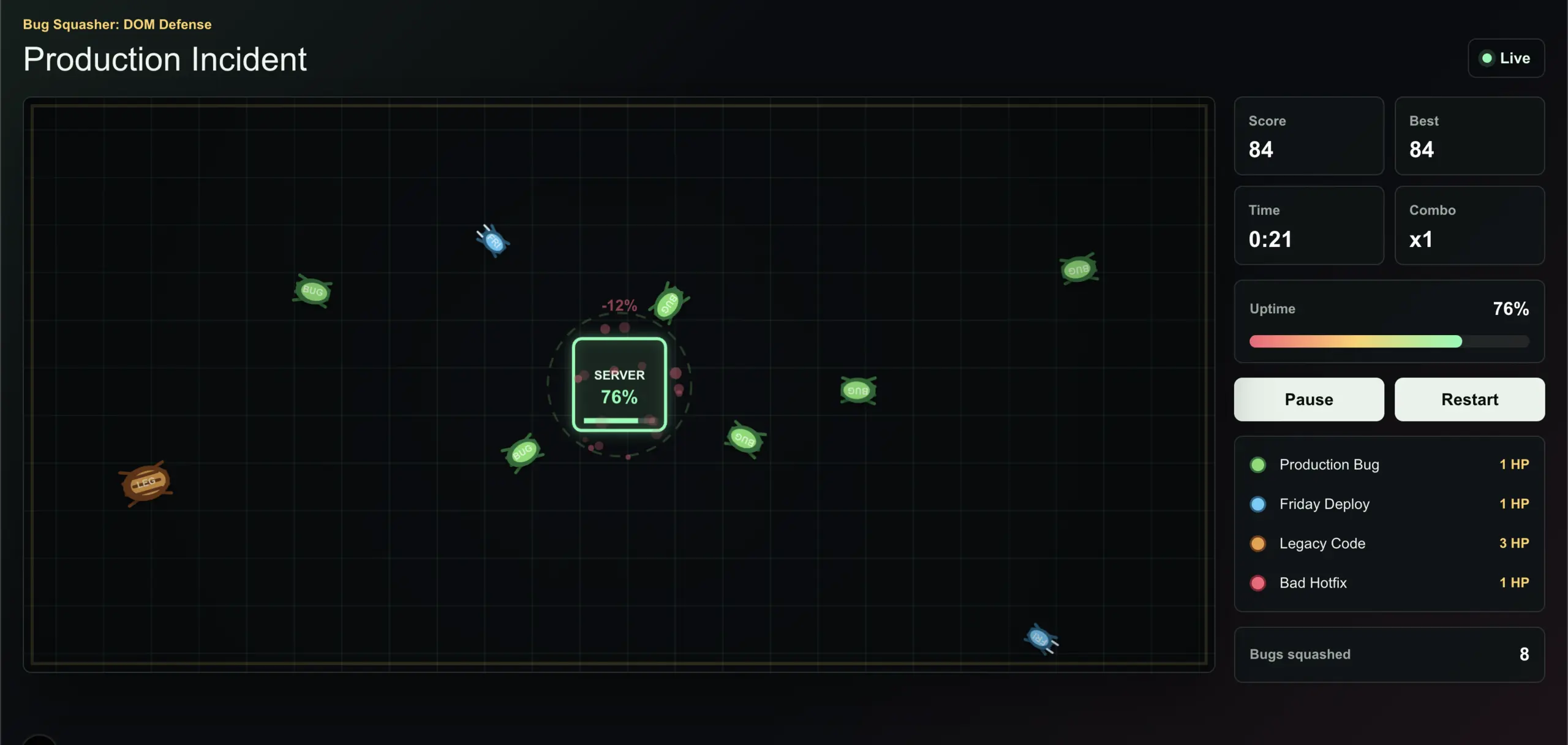
I was bored and wanted a break from client projects, so I made a little TypeScript game. Naturally, it ended up being about bugs taking down a server.

Android
A touch-controlled Android maze game built with Godot, packaged as an APK and tested on a real device. Draw, pause and resume your path through 50 levels, with image rewards and locally saved progress.
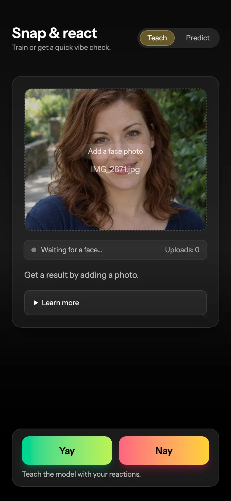
A private dating experiment that learns your visual preferences from yes/no photo ratings and scores new portraits against that feedback.
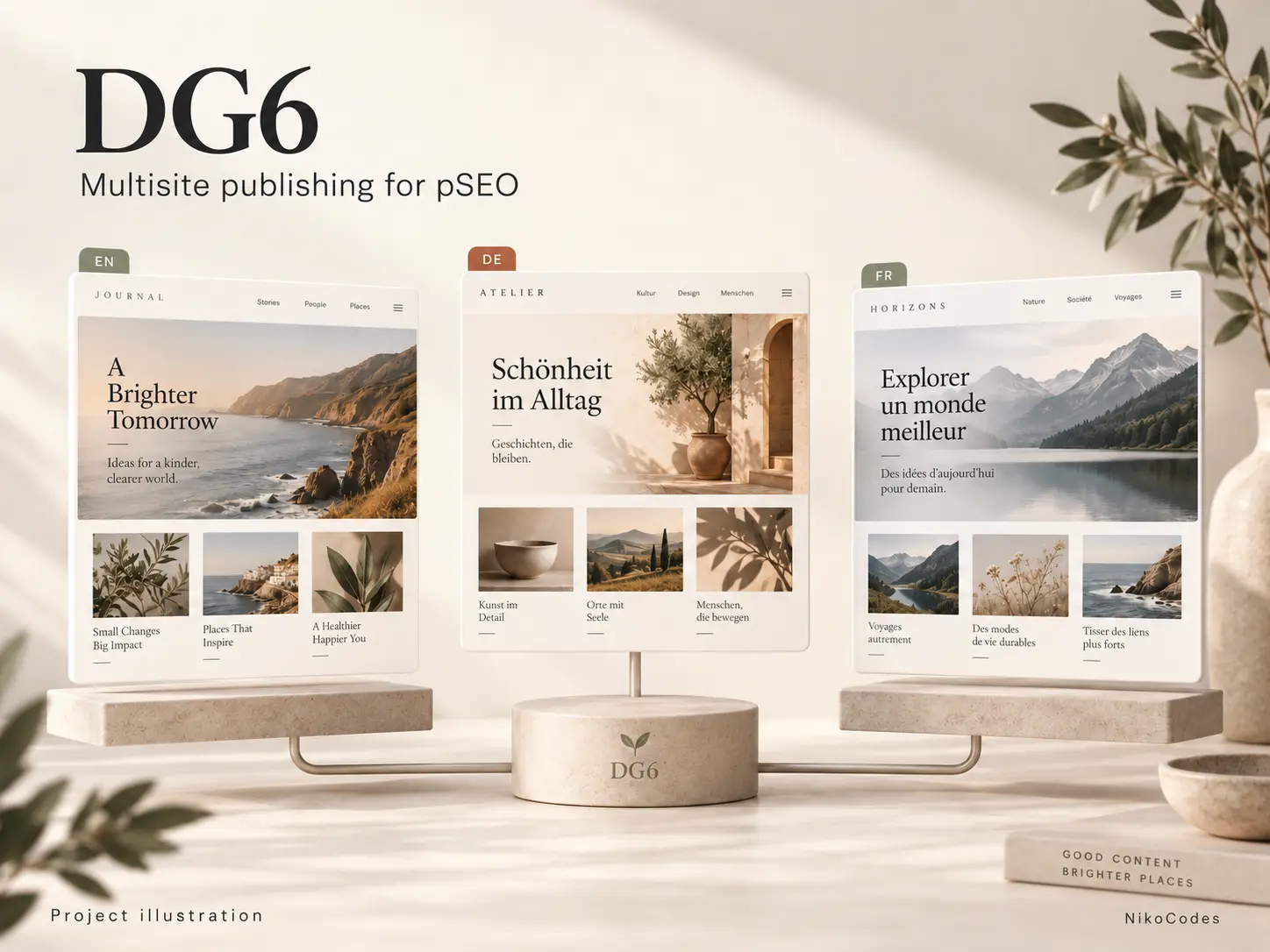
A Laravel publishing application for my programmatic SEO projects. DG6 turns generated content into multilingual websites, with separate domains, themes and publishing schedules, all running from one codebase.
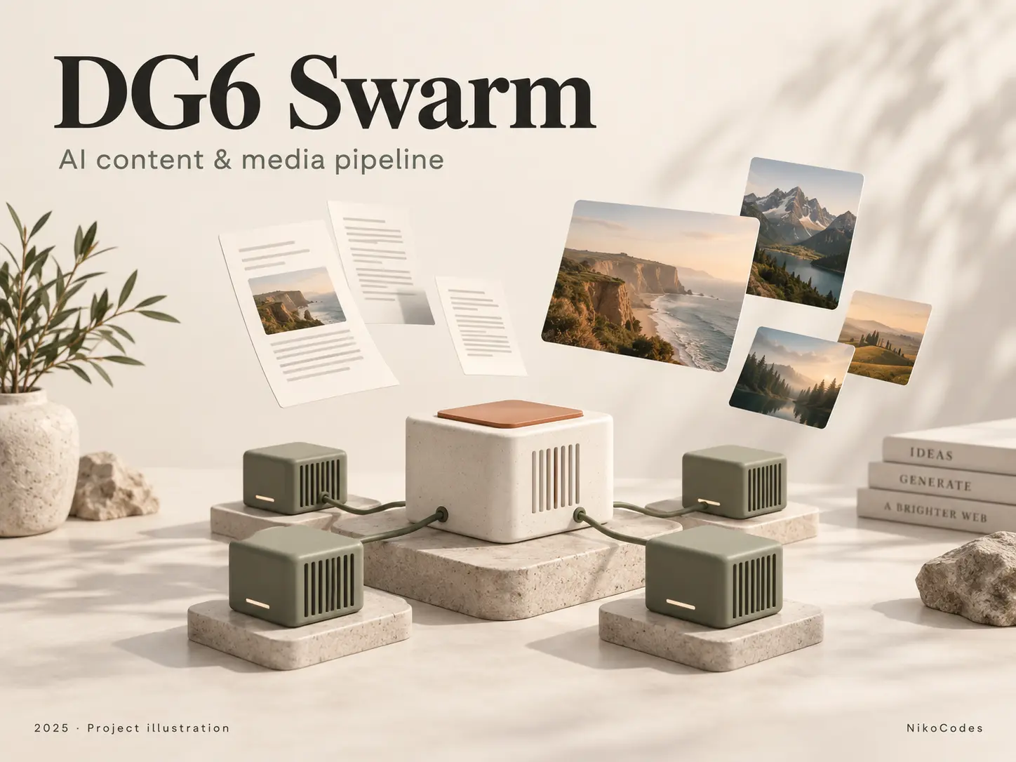
Content pipeline
A Python pipeline that turns a domain and starting keyword into site copy, articles and visual assets. Specialized GPU workers handle each stage, starting and stopping according to queued work.
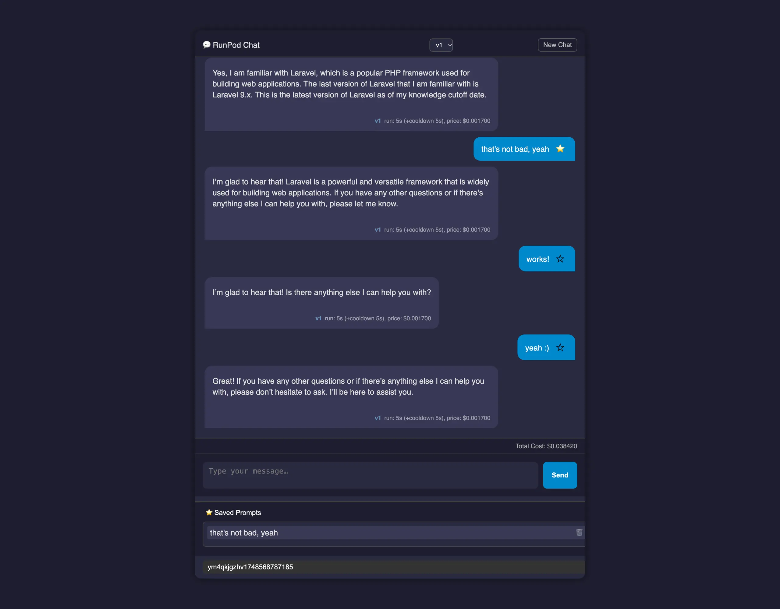
Earlier personal project - Private source
A lightweight PHP chat interface for RunPod, with saved conversations, reusable prompts, response timing, and estimated usage costs.

Client website
A custom PHP directory built for a client, with multilingual content, responsive listing cards, title search and a small admin interface for managing display order and destination links.

Archived project · Private source
An archived PHP utility for copyright-notice emails, keyword ranking reports, and PNG report generation from stored search data.